 Less than two months ago, in the moments following the Abu Dhabi Grand Prix, Formula One Management (FOM) proudly unveiled a new logo for the sport intended to - according to Chase Carey – "inject fresh energy and innovation”.
For the previous 23 years, the sport had jealously protected the sport's old logo which featured a slanted 'F' and stylised speed lines which incorporated the number 1.
However, keen to give the sport a new look, in November, the new owners, having bought F1 in a deal worth around $8bn at the start of the year, and keen to exorcise all that went before, unveiled the new logo on the Yas Marina podium and in the days that followed the new logo was incorporated into the sport's social media accounts, stationery, timing app and all else.
The new logo, created by Wieden + Kennedy, the advertising agency behind Nike's 'Just Do It' slogan, is essentially a stylised 'F', and it received a lukewarm reception from the drivers in Abu Dhabi.
 Asked what he thought of it as it was unveiled behind him on the podium, Abu Dhabi race winner, Valtteri Bottas, who like countryman Kimi Raikkonen, is not known for outbursts of enthusiasm, said: "I kind of like the old one. I only saw it very quickly".
"Just say you don't like the new one!" joked Sebastian Vettel
"What's wrong with the old one?" asked Bottas. "I don't know. I think it's quite cool."
"I liked the old one better," added Vettel.
"The problem with logos," chipped in Lewis Hamilton, "I think the one that we already had was an iconic logo I think. Just imagine Ferrari changing their logo, or Mercedes changed their logo. I don't think the new one is as iconic but maybe it will grow on us."
Well that was the plan, for under its new owners the sport is seeking to really push its brand, with the new logo making it on to all manner of items in the coming season(s) including T-Shirts, caps and various other items of other clothing aimed at boosting the brand and swelling the coffers.
Unfortunately, an extremely similar logo is already in use.
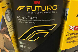
 While Chase Carey's version is intended to inject "energy and innovation" into the world's most glamorous and technical of sports, a version registered by the mighty 3M is designed for the comfort, support and therapeutic relief given by its Futuro brand of compression tights.
Indeed, that speedy 'F1' that is meant to adorn various clothing, websites and podiums, not to mention transporters and cars in the coming months, and is supposed to represent the "speed lines of two cars racing", is suspiciously similar to what 3M, in its trademark application, envisioned as a "stylised knee".
Writing in The Telegraph, Chris Sylt - who always likes to get to the bottom of such matters - reveals that a spokesperson for 3M has confirmed that it hasn't given F1 permission to use the design and that "3M filed a US trademark application for the Futuro logo on Feb. 20, 2017.
"We have not had any discussions about the logo with the other party. We are looking into this matter further," they added.
While records prove that 3M applied for a pan-European trademark on the logo in February 2017 and registered it four months later, F1 didn't file its application until November, just ahead of the Abu Dhabi unveil, and EU authorities are still deciding on whether to register it.
Rather than the Battle of Wounded Knee, this could well turn out to be the Battle of Stylised Knee, and whatever the outcome will be hugely embarrassing for F1, its new owners having made much of the energising and invigorating new logo and no doubt having already seen its way on to various items of clothing to be sold as the season gets underway.
Always keen to throw its weight around in terms of its rights, and with a vast army of lawyers on hand to enforce them, it's worth noting that while F1 is reckoned to be worth $8bn having enjoyed $1.8bn in revenue in 2016, 3M racked up $30.1bn that same year and is worth around $145.6bn
FOM's applications for its logo covers numerous options but excludes that for "therapeutic clothing" which 3M had applied for. Nonetheless this doesn't ensure protection for the F1 version because the products the logos are to be used on are similar.
Trademarks are "protected by a basic rule which prevents the registration or use of a sign identical or similar to a registered trademark, for goods or services identical or similar to those for which the mark is registered," concluded In 2008 Eleanor Sharpston, the European Court of Justice's Advocate General in 2008.
No doubt reeling from the news - and possibly in need of support - neither F1 or Wieden + Kennedy have commented thus far on a move which could see the sport's invigorating and energised branded clothing line heading beyond track limits and into the kitty litter as the EU's Intellectual Property office ponders whether to give F1 the green or red light.
On the other hand, there is a small crumb of comfort for FOM in that 3M proudly claims that its tights will improve circulation.
F1 and tights, eh... better not tell Uncle Lewis.
Picture Credit for 3M box: 'whatisdeletrazdoing'


sign in