
24/11/2017
NEWS STORY
 Over the years we have grown used to fans complaints about Formula One, but not once, not one single time was it in relation to the sport's logo.
Now, in a move many, certainly in the UK, will recognise, Liberty Media is looking to change the official logo of the sport.
We say those in the UK because in recent years it has become the norm not only of companies to change their logos, but official bodies, such as local authorities, often at vast expense to the taxpayer.
Indeed, much like race fans who only want to see the sport improved on track, taxpayers who seek improvements to their services, and at a time local authorities scream of government cuts, it seems there is always enough in the kitty for a change of corporate identity.
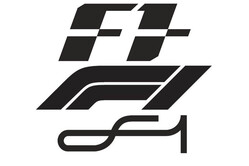
Revealing that the 'old logo', introduced under Bernie Ecclestone's supervision - and therefore bad - contained negative space, a reference to the blank space which is actually the '1' in 'F1', Chase Carey told Sky Sports that the new logo will be revealed at the end of the Abu Dhabi weekend.
"For sure," he said, clearly already well into the F1 mind-set, "any time you change you are always going to get a mixed set of views.
"What we wanted to do was provide a fresh energy to the sport, and I think have a lot of plans for the future and a lot of things we want to do.
"We thought the logo was a good way to emphasise the excitement and a fresh energy to take the sport to a new place," he added. "That's respecting where the sport has been, we are not looking to change the sport, we are looking to provide a fresh innovation and energy to a sport that is a great sport.
"We think we can enhance it and better it, to allow fans to engage in ways they maybe haven't had the opportunity to in the past around events that truly are the spectacle they should be."
 Whether the prospective logos, of which all three are currently registered with the European Union Intellectual Property Office (EUIPO), and one of which will be revealed as the sport's new official logo on Sunday, go anywhere near to addressing fans real issues with F1 remain to be seen, as does the claim that the new logo will provide "fresh innovation and energy".
So forget the impending row over prize money, falling TV figures, rules that prevent cars following one another too closely, the sound, Ferrari threatening to quit, one team having won the titles for the last four seasons and pretty much everything else, and be content that the sport has a new logo.
Of course, much like the hard-pressed taxpayer, it is the teams who will be picking up that tab for FOM's latest folly.
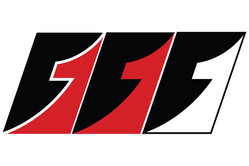
As for the "negative space", all three potential logos look horrendous. Indeed we much prefer those put forward by Crooked Cartoon (lower right) but what do we know?
Check out our Friday gallery from Yas Island, here.