

07/08/2012
NEWS STORY
 |
How can one image - a few strokes of a brush with some colour mixed in - represent a major international sporting event to millions?
The Olympics does it with five interlocking rings. Wimbledon does it with crossed racquets.
Organizers of the Grand Prix of America at Port Imperial had this challenge as they began to establish a brand for their event, the Grand Prix which will take place on the shores of the Hudson River in New Jersey in June, 2013.
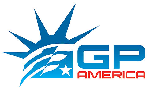
After reviewing dozens of renderings, the Grand Prix of America group chose a blue-and-red logo that features a stylized Statue of Liberty crown over a chequered-flag helmet, anchored by a single star.
It also has a hidden, artistic layer.
"If you lay the logo over the Statue of Liberty face, the flag works perfectly with the hair, and one of the checkers in the flag and the star line up with her eyes," says graphic designer Aaron Justus. "There's a link that may not be obvious to every viewer, but it's really cool how it worked out."
The logo was created by Racer Media and Marketing, a media and design agency directed by President Paul Pfanner. Although the Grand Prix of America staff considered a number of concepts, the Statue of Liberty was key to everyone. The iconic monument, which represents freedom and international friendship, graces the Hudson River harbor between New York and New Jersey.
Pfanner said it was a fitting symbol for the race, which will run on a 3.2-mile road course in the towns of Weehawken and West New York, N.J., with the dramatic New York skyline as the backdrop.
"The constant, through every planning process, was the Statue of Liberty iconography," he said. "It is shared between the New York metro area and New Jersey, something that the whole region and country can claim as an identity. It registers immediately as America to people. It's international, too - it's a gift from France to this country, which is an ironic metaphor; Grand Prix racing started on the roads of France and today is headquartered in Paris."
Pfanner, Justus and their associate George Tamayo worked on the brand identity for two months, in consultation with the Grand Prix of America management group. The first step was determining all that the logo needed to represent: the race and other associated events, the locale and the sport.
"We were naming the entity that was responsible for the race circuit and for the promotion and organizing of the event. It was the movement of bringing America to Formula One, rather than Formula One to America," Pfanner noted.
Then the graphics came together. The group agreed on the crown element, but Justus wanted it to be distinct. "The challenge was using such an iconic element and not being cliche or looking like clip art," he said. He analyzed 20 other logos that featured the Statue of Liberty to make sure his design was unique.
With the crown in place, Justus mixed and matched elements for the final logo. As he worked with the chequered flag, it flowed into a helmet shape, an unexpected but appropriate result. A star was added as a punctuation mark and the design trio settled on a clean, contemporary font.
"I took four straight days," Justus recalled. "I found elements, created pieces, assembled them and then moulded the logo like a piece of clay to make the proportions right. Suddenly, it came together."
In a big way. "We previewed it internally and had the strongest reaction we've ever had to a logo mark," Pfanner said. The Grand Prix of America team responded equally.
Their swift approval was another surprise for Justus.
"It doesn't always work out this way; there isn't a formula," he said. "This has been rare because we really liked it internally and there's not been any pushback from anybody. That's just not normal. But when people see it, they say, 'That's it!' It makes sense.
"It has to be as powerful in one colour as it is in multiple colours. At first glance, you have to know what it's trying to say. And it has to be able to reproduce in different footprints and on different canvases. It has to be versatile."
It is. Pfanner credited the Grand Prix of America team, led by executive chairman and promoter Leo Hindery, Jr., with the vision that ultimately created the brand.
"Promoting a Formula One race is a privilege, but it's also a great responsibility to the sport in general, to the communities and, of course, to the fans," Hindery said. "There is no more instant indicator of that sense of responsibility than the event's logo. We're grateful to everyone involved for giving us what will soon be, I believe, an iconic logo."
Pfanner agreed: "Over time, people will look at the Grand Prix of America iconography just like they look at the wing and wheel at Indianapolis Motor Speedway. We believe that this can really stand as one of the pinnacle identities in Formula One.
"I'm very proud of it - I keep it on my desktop and stare at it. Everybody involved in this knew we were working on something special."